 |
| 8 X 8" Hand Dye Painted Cotton by Eileen Gidman
After washing the fabric from the first
painting session (note previous post of July 27), I added details by
activating the dye this time rather than working on soda soaked
fabric. Darker colours were added to the raspberries as well
calligraphic drawing of details on the leaves. Light areas were left
to show the sunlight on the leaves, stems and berries. Those small speckles were added for
additional interest to the background.
As well, similar motifs were
painted on some pastel green and yellow fabrics. What a difference
the brand of fabric made! More on that later.
|
Friday, July 27, 2012
Step Two Raspberries
Step 1 of Raspberry Square
 |
| Step One |
After an hour of picking raspberries, I
ended up starting 4 fabric paintings of guess what? Raspberries!
After curing and washing, here is the
results of one of the dye painted cotton pieces. With the next step,
more detail can be added. In this piece, the dark
surrounding the light stems draws attention there. Although this is
an attractive look, it is is not exactly where the centre of interest
was intended so with the second layer, attention will be given to
providing detail to the berries.
Tuesday, July 24, 2012
A week of Watercolour Sketches
 |
| A Week of Watercolour Sketches Eileen Gidman 11 X 15" $55 |
Working in this format is motivating.
As noted in the previous post a light wash was applied to the
watercolour paper prior to it being divided into squares. Each day
last week, I either sketched with a black ink pen something that was
of interest to me that day or I completed a sketch in the studio with
watercolour washes.
What became evident working in this
format was the necessity to consider a whole composition along with
each individual watercolour sketch. Creating flow through the
watercolours was accomplished with the high contrast of the dark blue
with the lights. A complementary colour scheme of orange and blue was
adhered to throughout to further add cohesiveness. Note the perennial
sweet peas in the upper left in real life are pink. The advantage of
painting is the ability to change the composition and colours of what
you are painting, to create your own unique artwork.
Friday, July 20, 2012
Sketching Daily
Starting with a prepared piece of watercolour paper can bring a cohesiveness to a week of sketches. Here the 11 X 15” piece of watercolour paper is given
a light wash of the primary colours red, yellow a blue. Then the
paper was tape off into a variety of sized sections. Each day I sketch something that interests me. Sometimes on location or later in the studio some watercolour washes are added.
Early this morning the stand of fireweed was strikingly sunlit. The background of trees and sky appeared so very dark in contrast. The value (light and dark) of a colour is affected by the values surrounding it. An example of this is how white the fireweed looks with the dark blue background even though there is a light wash of the primary colours on them.
 |
| Watercolour Sketches |
 |
| Sunlit Fireweed |
Early this morning the stand of fireweed was strikingly sunlit. The background of trees and sky appeared so very dark in contrast. The value (light and dark) of a colour is affected by the values surrounding it. An example of this is how white the fireweed looks with the dark blue background even though there is a light wash of the primary colours on them.
Should there be
some purple and green colour added to the fireweed? That should be
alright if attention is given to provide a significant difference in
value with the background, however what first attracted to me to
sketch in the early morning was the brightness of the sunlight so I
have chosen to honour that and leave the plants with only that light wash
of the preparatory layer.
Thursday, July 12, 2012
Lattice
 |
| Lightly Sketching onto Fabric |
 |
| Painting with Thickened Dyes |
 |
| Completed 8" Square |
'Lattice' is a part of a
series 'Leaving the Whites'. On soda soaked and dried fabric lightly
sketch out the image. I discovered this porch in Kaslo, BC when I was out walking my dog in 2011. What a fortunate find as I have painted several variations from this photo.
A sponging technique was used to depicted the hanging baskets of flowers and painting around the lattice left the white of the fabric showing. Details to the whites were added in light grey.
Tuesday, July 10, 2012
Black and White Animals
This is a part of a larger series
'Saving the Whites'. I enlarged the photo and traced the main outlines onto the soda soaked cotton.
Wanting the white of the fur to stand out, the sky and lawn were painted in strong colours. I used a full strength thickened black dye to completer
the black fur being sure to reserve any whites. Note the
importance of the details showing her white whiskers and eye highlights. The nose was painted in a lighter grey for the hightlighted areas as were some of the shaded
parts of the white fur. The pink for the tongue was added. The
fabric was then placed between plastic and must be kept above 70 degrees for
at least 4 hours. After batching it will be rinsed in cool water and
then in a synthrapol wash.
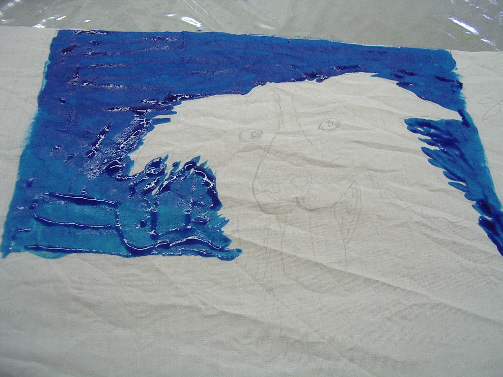 |
| Negative Painting Sky around the Dog |
 |
Hand (dye) Painted Image ready for Curing and Rinsing
|
Tuesday, July 3, 2012
Colour Interplay
 |

Likewise in quilting it is helpful to know what you want the quilt for when it is done. If I wanted to create a pieced quilt with the fabrics in the first photo, it would convey warmth and calmness due to the warm colours used and calm because the colours are side by side on the colourwheel.
Should I choose to add a little blue, a different feeling is attatched to the quilt. The blue plays off the orange, it's complement so that the blue just pops. If there is only a small amount of blue your eye is drawn to it and the look of the quilt would be quite lively. Both quilts might be quite similar yet convey very different emotions. Deciding what you want in a quilt is essential in deciding what colours to choose.
The same is true when dyeing fabric. Those small spots of blue look jewel like and are very precious in this dye painted piece.
 |
| Dye Painted Cotton - Sold |
Subscribe to:
Posts (Atom)